Sunday, October 31, 2010

INKSPIRATIONS COLOUR CHALLENGE #46 .... again!

I had some lovely time to myself, in my craft room, last night (while all three of my boys had a Mike Tyson DVD blaring).  I had already made one card for this week's Inkspirations Challenge #46, but loved the colour combo, and wanted to challenge myself to come up with a completely different card.  The first card I made was very soft, which didn't really reflect how I saw these colours initially:


So, for my second card, I added accents of Poppy Parade - such a bright, happy, orangey-red.  I have not shown much love to the Birds and Blooms sizzlits die I bought a while back, so the starting point for this card was to incorporate some of the cute Scallop Circles (I like to call them flowers) from the set of dies.  I started off by cutting out both sizes of Scallop Circles, in So Saffron, and adhering them to the top portion of my So Saffron card base.  This card is all about the texture!

Stamps: Perfect Punches
Card: So Saffron, Very Vanilla, Poppy Parade, Baja Breeze
Ink: Baja Breeze stampin' pad and marker, Poppy Parade marker, So Saffron stampin' pad and marker
Other: Birds and Blooms sizzlits die, Beautiful Wings embosslits, sponge dauber, Perfect Polka Dots embossing folder, Curly Label punch, 1" Circle punch, Basic Pearls, Poppy Parade poly-stitched ribbon, mini glue dot

INKSPIRATIONS COLOUR CHALLENGE #46

This week Makeesha has set a challenge to use these colours in a papercraft project:


I had to make a birthday card for someone very dear to me, and decided these colours would be a good starting point.  It may not look like I've used Poppy Parade (because it is such a vibrant colour in real life), but I have!  I wet some watercolour paper before adding colour, to dilute the Poppy Parade and Baja Breeze that I used to watercolour the hydrangea.  I'm surprised, but really pleased, with the softness of colour that resulted. 


Stamps: Very Vintage jumbo Stampin' Around wheel, Pocket Silhouettes, Because I Care (hostess set)
Card: Baja Breeze (smooth and textured), Very Vanilla, So Saffron, Watercolour paper
Ink: Baja Breeze stampin' pad, Jet Black Staz-on inkpad, Poppy Parade stampin' pad, Pear Pizzazz and Old Olive stampin' pads
Other: Aquapainter, sponge dauber, Beautiful Wings embosslits, Word Window Punch, Button Latte (retired), Very Vanilla 5/8" and 1/4" grosgrain ribbons, Top Note die, Mat Pack and paper-piercing tool, mini glue dots, Tombow multi glue, paper snips


Wednesday, October 27, 2010

JUST ADD INK #40

I can remember the excitement of Just Add Ink starting up .... and here they are, at their 40th challenge!  Thanks, girls, for the wonderful challenges you set every week; I love them.

This week is a colour challenge, to incorporate the following colours into a papercraft project:


I had need this week for a sympathy card, that I wanted to have a feminine touch.  It was a real challenge for me to incorporate the Pear Pizzazz, once I'd figured out my design, but I got it in there (in the sentiment)!  This is the card I came up with:


Stamps: Elements of Style, Teeny Tiny Sentiments
Card: Sahara Sand, Blushing Bride, Bashful Blue, Whisper White
Ink: Sahara Sand, Blushing Bride, Bashful Blue and Pear Pizzazz stampin' pads
DSP: Sahara Sand Patterns Designer Series Paper (from Neutrals stack)
Other: Eyelet Trim border punch, Word Window punch, Modern Label punch, sponge daubers, Basic Pearls, Blushing Bride poly-stitched ribbon, paper snips


Saturday, October 23, 2010

"TECHNIQUE" BLOG HOP

Today I am taking part, with 4 fellow Stampin' Up! demonstrators, in a "Technique" blog hop (just a "mini blog hop this time!).  Each of us is showcasing a different technique to use in your stamping and/or scrapbooking, so hopefully you'll get some new ideas!

You may have come from the gorgeous Nikki Sadler's blog, but if not, don't worry!  You can start here, and do a 'loop' by clicking on the link at the end of each participant's post, until you've covered all 5 stops.

The technique I have chosen to focus on today is PAPER PIECING.  This technique is ideal for using with line image (rather than solid) stamps.  It's an alternative to colouring in an image, and is a cute way to highlight a portion of a stamped image, to co-ordinate with patterned papers used on your project.

It's very easy to do.  Simply stamp your desired image onto cardstock, and stamp it again on patterned paper.  (Alternatively, you could stamp it onto other coloured card - either plain, or that you've stamped with a design.)  Cut the paper image out, and stick it over the top of the base image; voila - instant colouring!


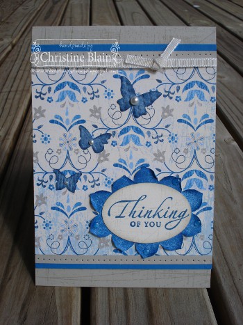
For my first card, I have stamped several of one of the "Fifth Avenue Floral" flowers on a Whisper White panel.  I've chosen to highlight just one of the flowers in red (I do love red, and polka dots - did you know?!), using "Play Date" Designer Series Paper.  This is a very simple design, but the paper piecing makes the flower really "pop", don't you agree?


Stamps: Fifth Avenue Floral, Bella Toile, Upsy Daisy
Card: Whisper White, Real Red, Crumb Cake, Basic Black
DSP: Play Date Designer Series Paper
Ink: Crumb Cake stampin' pad, Jet Black Staz-On inkpad, Real Red and Basic Black markers
Other: Sponge dauber, Basic Black brads (from Neutrals assortment), Stamp-a-ma-jig, Mat Pack & paper-piercing tool (for placement of brads)


Next up is a Christmas card, using Jolly Holiday Designer Series Paper.  I stamped the Christmas tree (from the ever-versatile "Fun & Fast Notes" set) on Very Vanilla card.  I stamped it again on the Old Olive spotty paper, and cut around just the foliage before adhering it to my card.  I coloured the trunk, pot and star with markers.

Stamps: Fun & Fast Notes, Contempo Christmas, En Francais
Card: Very Vanilla, Old Olive, Cherry Cobbler
DSP: Jolly Holiday Designer Series Paper
Ink: Cherry Cobbler stampin' pad and marker, Jet Black Staz-On inkpad, Chocolate Chip marker, Daffodil Delight marker
Other: Wide Oval punch, Old Olive 5/8" grosgrain ribbon, Scallop Edge punch, mini glue dot


Lastly, I'd like to share with you a birthday card I made with a young boy in mind.  Again I've used "Play Date" Designer Series Paper - this time, the striped "boyish" paper.  I love that each pack of Stampin' Up!'s Designer Series Paper contains such a variety of designs, that complement one another so well.  The nose of the rocket is paper-pieced with Real Red cardstock on which I had stamped a star.  Pretty cute little rocket, don't you think?

Stamps: Seeing Stars, Pun Fun, Party Hearty
Card: Chocolate Chip, Tempting Turquoise (textured), Real Red, Crumb Cake
DSP: Play Date Designer Series Paper
Ink: Versamark inkpad, Tempting Turquoise, Crumb Cake, Chocolate Chip, So Saffron and Real Red stampin' pads
Other: Top Note die, sponge daubers, Buttons #5 Sizzlits die, Scallop Circle punch, 3/4" circle punch, 5/16" silver brad, Crystal Effects


Next stop on today's blog hop is the blog of the super-creative Amy Buchanan.  This girl blows me away with her ideas!


Here's a list of all of us taking part today:


Judy May
http://www.judymay.typepad.com/

Nikki Sadler
http://www.inkyart.com.au/

Christine Blain
http://www.christineblain.blogspot.com/

Amy Buchanan
http://www.fashioninggreatimpressions.com/

Tina Gillespie
http://scissorspapercard.blogspot.com/


Have fun checking out everyone's creations, and please leave us comments so we know you've been to 'visit'!

Wednesday, October 20, 2010

MY CRAFT ROOM

It's nearly 2 years since my 'dream' craft room was added on to our house, and I don't think I have ever shared photos on my blog.  I keep telling myself I'll photograph it when I have all the piles of 'stuff' put away .... but, that day never seems to come, so I've decided to show you my space "as is"!!  If I had a spare mattress to put in my craft room, I'd happily live in there!

This is the view of my room when you first enter:


When I first got my own room for crafting, I bought that cute little desk from Ikea (LOVE the trestle legs with shelves on them).  However, I soon discovered that if I wanted to stamp with more than one person, it wasn't quite going to do the job!  I've added the plastic moulded table (with the mismatched chairs - must rectify that someday, when I venture back to Ikea!) so that I can run classes here.  It works well with my regular groups. 


Here is my much-loved Expedit bookcase, from Ikea of course:


I store all my Stampin' Up! A4 cardstock in plastic tubs on top of some cupboards (at the end of the table).  Scraps are kept in a clear A5-sized pocket at the front of each hanging file.:


This is my new storage solution for Stampin' Up! ribbons.  Works at the moment, but not sure what I'll do once I have full rolls of the satin ribbon in every colour, LOL.


Here's how I store my stampin' pads and ink refills (bless ebay):


My Stampin' Up! stamps are all kept in a separate bookcase (clearly I didn't tidy this up before taking the photo!).  Other rubber stamps (that don't get shown much love these days) are kept in shallow drawers, sorted by category, in my built-in U-shaped unit.


One of my FAVOURITE features of my craft room is my punch storage; fabulous, cheap but sturdy, rails from Ikea.  Below my punches is my 'cutting station' - paper cutters and Big Shot, with my Scor-Pal in the corner.


I store my Nestabilities (that don't get much love these days ... but, as a diehard papercrafter, I do love buying and hoarding supplies!) inside one of the double doors to my floor-to-ceiling cupboard:


To complete today's "tour", I'll show you my desk, where I sometimes sit just for the pleasure of looking out into the garden!


This room brings me so much pleasure; I hope it has made you smile, too.

CURTAIN CALL #52 - second card

Well, y'know, once I get an idea in my head, I just don't do things by halves.  Now, it might've taken me 52 weeks to actually take part in a Curtain Call Colour Challenge, but now that I've dipped my toe in, I couldn't just leave it at one card!  The colour combination this week is just stunning.  I am excited, too, because after I complained of having sold off all my Taken With Teal cardstock and ink, I found a scrap of card.  So, that's what I have incorporated in my second card.

Here, again, is the delicious colour combo that Stacey has challenged us with:


...... and here is my second attempt.  I like this one a little better, on the white card base.  What do  you think?  This card uses a few non-Stampin' Up! items; just giving myself a little change today.


Stamps: Silhouette Sentiments, Hero Arts Silhouette Vase
Card: Whisper White, Tangerine Tango textured, Chocolate Chip, Taken With Teal (retired)
DSP: Newsprint Designer Series Paper, Haiku (retired) Designer Series Paper
Ink: Tangerine Tango and Chocolate Chip stampin' pads, Versamark inkpad
Other: Paper Daisies, 1/2 " circle punch, Build-A-Brad, Medium Jewelry Tag Punch, Chocolate Chip taffeta ribbon (retired), Nestabilities

CURTAIN CALL COLOUR CHALLENGE #52

I have decided to try, for the first time, a Curtain Call colour challenge.  I just LOVE colour challenges, and got to have a little bit of time in my craft room last night.  Take a look at the stunning colours to be incorporated in a papercraft project:


Stampin' Up! has never released the colour Bermuda Bay in Australia.  Next choice I think would be Taken With Teal - however, I was rather ruthless in selling off all my retiring inkpads and cardstock when our new catalogue came out recently!  So, poor third choice (which really doesn't do the trick, but I gave it a go anyway) was Tempting Turquoise.  Here is my card, photographed in full sunshine just because it's Spring and we LOVE seeing the sun!!  This is Melbourne after all - it snowed not too far away from us just 3 days ago!


Stamps: Bella Toile, Flower Fancy, Sincere Salutations
Card: Tangerine Tango, Chocolate Chip, Whisper White, Tempting Turquoise
Ink: Chocolate Chip stampin' pad and marker, Tangerine Tango stampin' pad, Tempting Turquoise marker
Other: Whisper White taffeta ribbon, retired Chocolate Chip ribbon, Scallop Trim border punch, Colour Spritzer tool, Basic Rhinestones, Beautiful Wings embosslits, Stamp-a-ma-jig, sponge dauber


Tuesday, October 19, 2010

Well, well, well .... another BLUE card!

Having made the sweeping statement that I don't often use blue in my creations, I must admit that I am totally smitten with Stampin' Up!'s Marina Mist (and Baja Breeze) .... guess I need to eat my words!

A few days ago I ran an embossing class, and we focussed on the new "Elements of Style" stamp set - because I love it, and, hey, as the teacher, I get to decide these things!  I particularly like the Marina Mist card we made, so thought I'd share it with you.  Simple, but sweet, I think (hope you like it too!).


Stamps: Elements of Style
Card: Marina Mist, Whisper White, Basic Black
Ink: Marina Mist stampin' pad, Versamark inkpad
Other: White embossing powder, Beautiful Wings embosslits, Basic Black taffeta ribbon, Mat Pack and paper-piercing tool, 1" circle punch, 1 1/4" circle punch, sponge dauber, Basic Pearls, Tombow multi liquid glue


This coming Saturday (23rd October), a few friends and I are having a "mini" blog hop, that is technique-based.  Even though there will be only 6 of us taking part, we are each showcasing a different technique to use in your paper crafting - hope you'll come back to visit, to get some ideas!

Saturday, October 16, 2010

JUST ADD INK #39

October is a busy month, for raising awareness of issues that I have close personal experience with.  As well as being Breast Cancer Awareness month, this month is  Anxiety and Depression Awareness Month.


Over a million people in Australia alone live with depression. Over two million have an anxiety disorder. With the right treatment, most people recover.  I count myself amongst the lucky ones.

beyondblue Anxiety and Depression Awareness Month provides an opportunity for workplaces, community groups and individuals to take part in activities to raise awareness of anxiety and depression, and help reduce the associated stigma.  It's easy to help raise awareness. Sometimes the simplest acts have the greatest impact - just talking openly about anxiety and depression helps reduce the stigma.  You can find out more at beyondblue.org.au

This week's challenge over at Just Add Ink is "Just Add Blue ..." I really LOVE colour challenges, but I have to say this one really was a challenge for me; I don't often use blue in my paper-crafting, and it is definitely not one of my "go to" colours.  Having said that, in my determination to add blue to the palette of colours I use in my card-making, I did recently buy Stampin' Up!'s new "Blueberry Crisp" Designer Series Paper.  I seriously love these papers!!  I like the 'denim-y' look of some of the papers (check out the little butterflies on my card). 


Do you like the wide 'flower' that the sentiment is matted on?  I was pretty pleased with myself, for making this!  It is made from three of the large flower, from the new Birds & Blooms Sizzlits die.  I placed the flowers behind the oval, and cut off the excess petals so the flowers sat nicely around the edge of the oval.  I used my fingernail to rough up the petals a little, and pinched them to curl upwards.  A few drops of Crystal Effects were added, to give the look of dew on the petals.

Here are the 'ingredients' for making this card:

Stamps: Sanded, Sincere Salutations
Card: Sahara Sand, Pacific Point, Very Vanilla
Ink: Sahara Sand, Not Quite Navy, Pacific Point stampin' pads
DSP: Blueberry Crisp Designer Series Paper
Other" Birds & Blooms sizzlits die, Wide Oval punch, Beautiful Wings embosslits, mat pack and paper piercing tool, Basic Pearls, sponge daubers, Very Vanilla 1/8" taffeta ribbon, Crystal Effects, Tombow multi-purpose liquid glue

Monday, October 11, 2010

BLOG AWARDS

Since I ventured into the world of blogging last year, I have made so many special connections with other beautiful women, who share their talents and lives through their blogs.   Over the past few (super-busy) weeks, I have been on the receiving end of three "blog awards", from dear friends who enjoy visiting my corner of the world on blogland.  I've been a bit remiss in acknowledging, and passing on, these awards, but I now have time to sit down and share them here!

Take a look at this little cutie:


Just the look of the 'award' made me smile, before I read the sentiment behind it.  I received this award from two wonderful women, who inspire me and make me laugh on a regular basis ... it is a bit eerie how much I have in common with Jodene and Helen!  Jodene, I can't wait to catch up with you at Convention next May; and Helen, I'll see you in a couple of weeks!  Thank you both for passing this award on to me!!

I have also received, from gorgeous Patrice, this award:


Thank you, Patrice; you already know I think you are a sweetheart! Wish we lived closer.

With cupcakes, polka dots, hearts and a cute owl, these awards just make my heart sing!  Too cute!

Now, the condition of receiving these awards is that I tell you a few things about myself, then I pass the awards on to 5 others whose blogs I love.  Boy oh boy ... that is no easy task.  I know that some of my much-loved blogging friends have already received these awards recently, so I have decided to share the love around a bit.  First, though, I'll tell you three gripping facts about myself:


  1. I am a stickler for correct spelling and punctuation, and missed my calling as a professional proofreader! LOL.
  2. I think a world without tomatoes and cheese would not be worth living in.  (Oh, and Pascall's marshmallows in the 4 colours, for that matter.)
  3. I have a bit of a strange affliction when it comes to hanging out my washing.  If a piece of clothing requires 2 pegs, they HAVE to match in colour.  Must have matching pegs!!  I've been known to not hang something on the line if I can't match the pegs.  (Sad, but true.  Actually, I'm quite proud of this quirk in my personality!)

I am going to pass on the "Cherry on Top" award (for the simple reason that it was the first I received, and I've just done a bit of amalgamation in this post, that unnecessarily confuses things!) to the following women who bring a lot of joy to my life:


Go check out their blogs - they're beautiful!

Saturday, October 9, 2010

JUST ADD INK #38

October is Breast Cancer Awareness month, so please visit the Cancer Council's website at www.pinkribbonday.com.au, to see how you can help the cause.  Is it too much to dream that we will have a cure for this disease in this generation?  Five years ago this month, I lost one of my dearest friends to breast cancer, and I am sure that most of you, like me, know someone who is also a breast cancer survivor.  Let's do all we can to make sure ALL women, and men, who have breast cancer, are survivors.


The challenge for this week, at  Just Add Ink, is to "JUST ADD BLING .... AND PINK!!", to a papercraft project. 

Here is the card I came up with:


Stamps: En Francais, Trendy Trees
Card: Crumb Cake, Whisper White (smooth and textured), Pretty in Pink
DSP: Crumb Cake and Pretty in Pink Patterns Stack Designer Series Papers
Ink: Pink Pirouette and Crumb Cake stampin' pads
Other: Pretty in Pink satin ribbon, Word Window punch, Modern Label punch, Two-step XL Owl punch, Two-step XL Bird punch, Basic Rhinestones, sponge dauber, Perfect Polka Dots embossing folder, mini glue dots, Tombow multi glue


I took the photo in late afternoon light, so it's not great, but I am rather pleased with how this sweet card turned out - hope you like it too!

Wednesday, October 6, 2010

"EXTREME ELEMENTS" - yes, more!

On the weekend I had friends over for a stamping session, so we could all escape the AFL Grand Final (apologies to football lovers, LOL).  It was a great afternoon, and Judy even stretched WAY out of her pink, girly, floral comfort zone to make a great card using Extreme Elements - click on Judy's name to check it out!

I wasn't very productive while the girls were here, but afterwards I had a play with Extreme Elements, as I wanted to try out a girl's card using these stamps.  I still wanted it to be a bit edgy and grungy, so I turned to my new Color Coach (a 'swatch' collection of all Stampin' Up!'s colours) for inspiration.  The Color Coach is a fantastic tool; it contains heaps of suggested colour combinations that you might never think to use.  Like this one - Melon Mambo, Elegant Eggplant, and Old Olive.  Take a look, and tell me what you think! 


Stamps: Extreme Elements, A to Z, Perfect Punches
Card: Crumb Cake, Whisper White, Melon Mambo
Ink: Melon Mambo stampin' pad and marker, Elegant Eggplant stampin' pad and marker, Old Olive and Crumb Cake stampin' pads
Other: Wide Oval punch, stampin' dimensionals, sponge daubers, edge distressing tool, Basic Rhinestones, Colour Spritzer tool


Ethan (10) 'went to town' with my Extreme Elements stamps, and sheets of Whisper White card, to make up a number of 'one sheet wonders' that he says he'll make into cards.  (It's more likely that, like his mother, he'll stash them away to use one day, and won't get around to doing anything with them!)  He wanted me to share with you the two cards he made on the weekend.  I especially like the Cherry Cobbler one.


Right, I really must go and make some cards with stamp sets other than Extreme Elements!

JUST ADD INK #37

My favourite weekly challenge site, Just Add Ink, has a colour challenge this week, to use the following colours on a papercraft project:


I decided to break out my long-neglected "Tart & Tangy" stamp set, and use a bit of creative licence to colour the cherries and strawberry  Rose Red.  After adding Crystal Effects, the colour looks a bit more like Real Red, but I assure you I used the right colour!

Here's the bright, fruity, card I came up with:

Stamps: Tart & Tangy, Cheep Talk (sentiment)
Card: Whisper White, Shimmery White, Always Artichoke, Pumpkin Pie, Old Olive, Rose Red
DSP: Rose Red and Pumpkin Pie Patterns Designer Series Paper
Ink:  Always Artichoke marker, Pumpkin Pie stampin' pad and marker, Old Olive marker, Rose Red stampin' pad and marker
Other: Scallop Edge border punch, 1 1/4" square punch, 1 3/8" square punch, Old Olive satin ribbon, Sherbet and Playground Designer Series buttons (retired), sponge daubers, stampin' dimensionals, mini glue dots, Crystal Effects